8 Useful Tips to Improve UX on your E-store
There is no better way of reducing the bounce rate of a website than to improve its UX. In case you don’t know what a bounce rate is, it is the percentage of a website visitors who leave the site after visiting the first page. High bounce rate essentially means the website fails to engage users and happens when either users don’t have a good first impression or don’t find what they are looking for.
Not only does a good user experience reduce bounce rate but it also lifts other metrics. Whether it is engagement, conversions, brand reputation or customer’s trust, a good UX design improves it all. A poor UX design, on the other hand, frustrates customers and hinders sales. Improving a website’s UX should, therefore, be the top priority of all businesses.
So, what is Website’s UX?
Website’s UX means the way users interact with your website. It represents the overall look, feel and usability of your site. It involves each and every element that contributes to shaping a customer’s experience. A good UX makes it easy for customers to read the content, navigate through the site, find what they are interested in and fulfill the desired tasks.
There are many web design tips you can use to improve UX. Here, we list the 6 most important.
1. Make it Easy to Navigate
Navigation is what allows your customers to explore other sections of your site. They are on your site to find something and it’s your job to make it easy for them. The rule of thumb is that customers should be able to find what they are looking for within 3 clicks, unless the website is too large or the catalog is too vast.
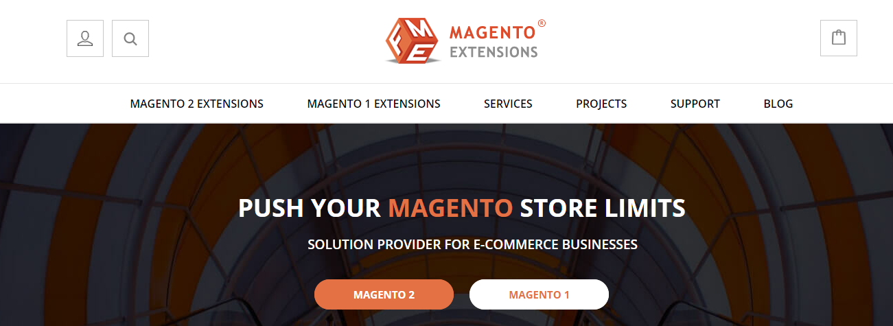
It’s not just about how easy your navigation is, it’s also about how intuitive it is. Customers should have an idea about the content of a page even before clicking on its link. Make all navigation elements clickable links. Don’t clutter your page with navigation menus and don’t change them from page to page. Take, for example, FMEextensions, a leading Magento 2 development company. It has a nice looking and simple navigation encompassing all the important sections of the store.
2. Stay Consistent
Your website should display consistency when it comes to fonts, colors, spacing and button sizes. Avoid using multiple fonts and color schemes. It is unprofessional and confuses customers.
Keep your website simple yet visually appealing. Use font and font size that is easy for online reading. Use colors that don’t irritate customers. Consistency is required for visual elements only. For text, you can be diversified to provide users with rich content and also to accommodate your keywords.
3. Work on Speed
Websites that load fast have an instant positive impact on customer experience. Users want everything quick and so slow loading websites tend to have high bounce rate. 40% users leave a page if it takes more than 3 seconds to load.
There is so much you can do to improve your website speed. Use compressed images, setup a content delivery network, enable browser cashing, minimize server response time, and minify CSS & JS files among other things. Get your content to load before images so that visitors have something to read.
4. Build Strong Call to Actions
Ultimately, your customers have come to your site to perform one of a handful of actions. If you are running an ecommerce store, they want to shop. If you are running a site for a restaurant or dentist office, people want to book a table or an appointment. Make these things easy with strong and obvious call to actions.
Use bold color and buttons that your customers want to click. Use clear language that let them know that you are there to help. Every page should start with that aforementioned call to action and end with another type of call to action if the subject matter on that page differs.
5. Make it Responsive
The number of people accessing the internet through their smart phone is rising. Make sure your site looks good on a variety of devices and shapes itself to fit the device. Your layout should be clear on tablets and smartphones and CTAs should be as clear as possible. For sites that are reading or text based, make sure they are easy to read and text blocks are optimized.
6. Use Original Images
An image conveys what hundred words can’t. Images are increasingly important and every website need them. Use your own genuinely photographed images rather than stock images to build customer’s trust and grab their attention. Originality matters and creates a satisfying user experience. A study by VWO shows that genuine images increase conversions by 45%.
7. Use White Space
While white space takes up space, it is essential to good design. It makes your content more readable and your website look more professional. According to Crazy Egg, white space around text and titles increase user attention by 20%. However, too much white space should be avoided especially at the top of a page to free some area and display more valuable information. The key here is to find the balance between what to communicate and where to leave some space.
8. Write Targeted Headings
Well designed and targeted headings are what make your content stand out. Make sure your headings are driven by what potential customers are looking for. Headings guide your user through the site, making it easy to scan through. Just by looking at the headings, customers should have a clear idea of what the whole page is all about. Keywords rich headings will also help you in search engine visibility.
Conclusion
Your website is a representative of your business. It is your most powerful asset and the building block of your marketing efforts. Effective website UX is mandatory not only to improve the overall user experience and provide them value but to further your bottom line. Do everything that make your website more user friendly, contemporary and relevant.


0 Comments